Exercise 5.1: The Distance Between Us

Use your camera as a measuring device. This doesn’t refer to the distance scale on the focus ring(!). Rather, find a subject that you have an empathy with and take a sequence of shots to ‘explore the distance between you’. Add the sequence to your learning log, indicating which is your ‘select’ – your best shot. When you review the set to decide upon a ‘select’, don’t evaluate the shots just according to the idea you had when you took the photographs; instead evaluate it by what you discover within the frame. 


For this exercise I visited Alnwick Garden. Situated within the grounds of Alnwick Castle, and is part of the Duke of Northumberland’s Estate.  The Duchess of Northumberland created it in 2001, from an original garden by Capability Brown which had fallen into disrepair. The garden is a series of formal gardens with complex planting and formal structures.  As a keen gardener the distance between my dream garden and this vast area of cultivated land is immense.  I was interested in the combination of planting and structural designs.  The elaborate fountains are integrated into the planting plan and provide an interactive opportunity for visitors.

I found myself drawn to the structures in the garden, some of them created with the plants themselves.  This was unexpected as I had imagined that I would be taking lots of shots of flowers and plants.

Alnwick Garden (3 of 11)

I took this image because I liked the leading line and the enclosed pathway created by the arched beech tunnel.  I am wondering what lies behind the bend in the pathway in this shot.  I had not expected there to be lighting in the tunnel, seen here below the white box on the left hand side, because the garden is only open during daylight hours.  This left me wondering why?

Alnwick Garden (1 of 11)

The garden is famous for its water features, and many of them are purely decorative.  I was drawn to those which had curtains of water falling from a flat surface and once again, found myself wondering what was behind the screen of water and wanting to get behind it, hiding, looking out onto those passing by.  I took several shots of this type of fountain and in particular liked the line of the fountain rim showing what appears to be a gentle fall of water but which was in fact a massive amount of water, creating quite a lot of noise.  Again, an unexpected find, as I assumed that the use of water in a garden was to provide a more relaxing type of noise

Alnwick Garden (10 of 11)

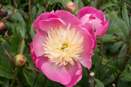
Even within the formal flower gardens there is structure to the design and structures within the design.  These enormous vases are an example, and the contrast between the peach roses and the blue delphiniums both in colour and size was an interesting discovery.  The vases are built-in with unique stone slabs which host an array of colours complementing the flowers.  Who made these solely decorative and extravagant pieces of art?  Although I had visited the garden previously, I had not noticed the vases (my photographs show that they were there), and I realised that gardens can provide a surprise for visitors and viewers.

.

Alnwick Garden (5 of 11)

Because of the size of the garden the scale of the structures within it are also very large and I was drawn to this monkey because of his face (one of three), holding up and enormous urn .  I couldn’t decide if he was laughing or trying to scare people away.  Although, the garden is only 15 years old the patina on the urn was well established and it looked like it had been there for hundreds of years, which made me wonder if it had been an original included in the Capability Brown design.

Alnwick Garden (6 of 11)

In this cropped shot the flatness of the water provided a lovely mirror to catch the reflections of passers-by.  The feature was in a circle of enclosed planting which meant it was impossible to capture the people and their reflections.  I initially rejected this shot but really like the effect and decided to crop it to lose the torso of the people, but left in the structure on the right which is a reflection of the fountain in another enclosure.  I was tempted to turn the shot on its head to replicate a mirror but decided to leave it because it creates a mystery about the people and why they might have been there.

Alnwick Garden (4 of 11)

The garden is also famous for its enormous Treehouse restaurant.  I was disappointed not to be able to get a decent view of the Treehouse because of the foliage growth around it.  However, down a track behind it I found a series of walkways and rope bridges, built just for fun for visitors to enjoy when visiting the restaurant and cafe within the building.  The tower gives an idea of the scale of the building.

Alnwick Garden (8 of 11)

Although, technically this isn’t a great shot, I wanted to demonstrate the way the structures provide interaction for  the public.  On a previous visit the day was hot and sunny and the fountains were full of children fully clothed which was surprising.  I don’t think I would have allowed my children to dive in and out of water fountains when they were small but it appears with the development of this type of water feature around the country it is more acceptable than 30 years ago.

Alnwick Garden (7 of 11)

Just before I visited the garden on this occasion I had been studying Ernst Haas and this is an example of Homage to his photography.  I asked the girl in the previous shot to swirl the water so that the ripples were coming toward me but it didn’t really work so I created the ripples myself. The now previously flat surface of the water is disturbed but still creating a sense of calm.  This is perhaps the way I might describe how I felt about the garden.

Alnwick Garden (9 of 11)


One of the streams leading to the main fountain is stone bottomed which provides a lovely surface for the water to bubble and tumble over.  Like all of the structures they have been carefully created to provide interest.  Some are straight, and some like this one are gently curved.  In contrast to the fountains with the flat surfaces this creates a sense of excitement and left me wondering where it was going and what I was going to find when I got to the source at the end of it.

Alnwick Garden (11 of 11)

My selection.   In terms of the brief of the exercise all paths and streams lead to this point.  The Grand Cascade.  Here I am waiting for the fountains to start and I have distanced myself from it and the other viewers.  I am behind a bank of plants and the other people are unaware of my presence.  They are all getting on with their own thoughts about the garden.  The man in the mid ground is pushing a wheelchair and talking to the person in it, the person behind the central yellow flower had their arms folded.  What are they saying to the person almost completely hidden behind the plants?   There is a woman in the central ground with her arm on the back of a child. In front of them is a couple, one sitting and one standing, and then the  child in the centre at the bottom of the cascade is standing with her hand to her face, waiting in anticipation for the spectacle.

All in all the distance between me (the photographer) and these shots has surprised me.  From the scale of the garden, the clever designs using structure and planting that I would never have considered, through the discovery of the many paths, tunnels (including a bamboo maze) leading me to another surprise, of the distance between me, there for the purpose of taking shots for this course and all of the other visitors, there for their own reasons.  A very revealing exercise for me.

La Gacilly Photo Festival, Morbihan, Brittany: Japan

I first came across this annual photo festival in 2015.

The pretty town of La Gacilly in the Morbihan district of Brittany has for the past thirteen years, hosted an annual photo festival.  The exhibition is outdoors and exhibits can be seen throughout the town.  The cosmetic company of Yves Rocher Foundation has it’s headquarters there and whose goal is “the protection of nature”. and it strongly supports the festival. The Rocher company has it’s herb garden in La Gacilly where it grows flowers and plants for use in it’s products.  It is here in the garden where a large proportion of the exhibits are displayed.  A visit to the festival is like attending numerous exhibitions (31) and I will document my visit in parts covering the three themes of the exhibition.

There were three themes for 2016, Japan, Oceans and Environmental issues.  The main focus was on Japanese photography which the organisers state is often ignored.  In addition to the main themes there are categories for colleges and schools and also for three up and coming young photographers chosen by a panel of the organising committee.

This first review is of Japan and I have to agree I came into the description of the organisers of not really knowing or having seen many Japanese photographers.  I loved them all for various reasons.  The dedication of Ohyama, the simplicity of Ueda and the documentary of Tanumasoj.

The Japanese photographers:

Yukio Ohyama: who has dedicated his life work to photographing Mount Fuji and there were 3 enormous installations on the wall of two buildings.

Mount Fuji, La Gacilly

Mount Fuji, La Gacilly2

Shoji Ueda: who returned to the sand dunes near to his home in Tottori as his backdrop to photograph over and over again his family and friends and creating what has been described as as series of stills as if from a film strip.  He developed a particular surrealist style which made him famous. However, The Guardian  (accessed 17.8.2016) in December 2015, hailed his book as “the most beautiful, surprising photobook of the year” and which included shots from other of his photographic series.

The shot below is typical of Ueda’s style with vast empty space and simple composition.

downloadShoji Ueda (accessed 17.8.2016)

Takeyoshi Tanumasoj: With the ascension of Hirohito to President in 1945, a new society was created in Japan.  Photographers moved to this new era by abandoning beginning to capture reality as opposed to the old style of propaganda romanticism of previous imagery which hid the real Japan.  Takeyoshi, inspired by Cartier-Bresson  immortalised the shift to modernism.  His street scenes captured in “the decisive moment” style documented the changes in the Japanese urban population as they began to adopt a Western lifestyle. I particularly like this image that captures the “modern” young women looking disapprovingly as their traditionally dressed counterparts.

tanuma-classic-and-modern-cos-at-Sanja-festival

Takeyoshi Tanumasoi

The three Japanese photographers that I have described above are only a few on display at La Gacilly.  What I observed about all three photographers was that they discovered a style which worked and became famous for their series in the chosen style.  However, it did not prevent them from going on to develop other creations which were in at least moderately different and at greatest totally different to what they originally became famous for.

There were more Japanese photographers exhibiting and all had something credible and often incredible to say, from the changing world of Japan and the early diplomatic exchanges with Europe, to the busy cityscapes and beach scenes and the tsunami and nuclear disasters of the country.  Some of which I will cover in my review of the themes.

I found the photography often moving and iconic and if you are travelling in Brittany before the end of September (or between June and September 2017) I would highly recommend a visit to La Gacilly (but beware it gets crowded on August Bank Holiday weekend – the one nearest to 15th August).

https://www.google.com/maps/place/La+Gacilly,+France/@47.7724061,-2.2245041,12z/data=!3m1!4b1!4m5!3m4!1s0x480fa242eb6c30d3:0x6062024848c53b24!8m2!3d47.7651619!4d-2.1312


Assignment 4 – The Language of Light

Revisit one of the exercises on daylight, artificial light or studio light from Part Four (4.2, 4.3 or 4.4) and prepare it for formal assignment submission:

  • Create a set of between six and ten finished images. For the images to work naturally as a series there should be a linking theme, for instance a subject, or a particular period of time.
  • Include annotated contact sheets of all of the photographs that you’ve shot for the exercise (see notes on the contact sheet in Part Three).
  • Assignment notes are an important part of every assignment. Begin your notes with an introduction outlining why you selected this particular exercise for the assignment, followed by a description of your ‘process’ (the series of steps you took to make the photographs).
  • Reference at least one of the photographers mentioned in Part Four in your assignment notes, showing how their approach to light might link in to your own work. Conclude your notes with a personal reflection on how you’ve developed the exercise in order to meet the descriptors of the Creativity criteria. Write 500–1,000 words.

Introduction

I struggled with a focus for this assignment.  Following a discussion with my tutor, I approached the assignment with the thought that I would focus on Old Masters Paintings, trying to replicate the type of light (Exercise 4.4 https://lynda514949.wordpress.com/wp-admin/post.php?post=1426&action=edit .)found in these paintings using artificial light.  I researched and looked carefully at other photographers that had attempted a similar project.

Many of the photographers I explored seemed to try to replicate the painting as closely as possible at least in style and colour if not in content.  I felt that didn’t meet the “Creativity” guidance in the assignment brief.  Initially, I considered taking just one element of one of the paintings and deconstruct the shots of say a lemon or skull but in the end I decided to construct a “traditional” style shoot followed by a more “modern” approach using the same or similar compositions but the juxtaposition of ancient and modern.

By making this decision I was moving way out of my comfort zone, preferring to shoot in daylight or natural light.   Following my attempts at Exercise 4.4 and Ex Nihilo, I decided that proceeding with the assignment using controlled artificial light would be an ideal opportunity to improve my understanding of using lighting in photography.

The use of light in Old Masters paintings has always fascinated me as to how they achieved the romantic and idealistic results they did.  However, unlike photography where the camera reproduces what it sees, an artist can interpret the environment, change colours and shapes to suit the composition and the lighting in it if it improved the painting.

I am not attempting to reproduce the old masters in either traditional or modern setup, more an attempt to study the compositions they used and how to make the best of light to produce a pleasing photograph that also shows the difference in lifestyle from the subjects used in original still life to that of modern day living.  I also wanted the modern shots to be starker as juxtaposition to the romanticism of the old paintings.

I took over 200 shots and several re-shoots to reach my final panel.

Process

I made several mind maps and lists (Appendix 1) to help me think through the subject and approach.

I roughly sketched the layout (Appendix 2) for each of my four chosen compositions using the juxtaposition of traditional and modern arrangements.

I have a simple studio set up with two constant lights and no soft boxes. I also have a range of reflectors and used the gold reflector on some shots.  I chose a black velvet background for the traditional shots and a hessian background for the modern shots.

I used a dark background for the traditional shots as was usual[i] in Old Masters paintings and deliberately chose a light background for the modern shots to carry on the juxtaposition of the project.

The hessian did not work on some shots and it was difficult to keep a consistency of focal length because of lack of space (I set up my “studio” in a bedroom).

For most shots I lit from the side using one or two lights applying the family of angles to achieve the best outcome. Occasionally, I tried lighting from the front but this cast dark shadows on the hessian fabric.  However, it worked better on some of the traditional shots against the black background.  I attempted the shots using a 50mm lens but I needed to get in close and in the cramped conditions the lights were often in the way.

I tried a number of lighting combinations paying attention to the “family of angles”[ii]

I shot all of the traditional shots in one shooting, setting the WB to daylight and ISO to 100.  I then experimented with several exposure and shutter speed settings checking the results as I shot each set.

I then shot the modern set, adjusting the settings for the lighter background.  With the hessian background I found that it worked well and the flatness of the fabric meant that the light was less likely to reflect on it, however it did pick up shadows of both the subject and the anomalies in the fabric itself.  Additionally, it creased easily when I was trying to adjust it.  This is where I needed to do the most reshoots.

The lighting was very harsh and I tried tying white polyester fabric over the lights to give a softer effect but it was still very harsh.  I also felt that all shots were pretty flat and boring, so in my second attempt I experimented with a shorter depth of field and moving the lights around.

Having further reviewed my research, I made the decision that by comparison my images did not meet the criteria of a still life image, which focuses on the subject with little background interest.  All my images contained too much background.  I tried a closer crop from the camera but because of the restrictions and barriers in my “studio” I could not move far enough back to get the whole of the subject in and I had already tried with a 50mm lens.  I therefore, made the decision to crop the images in the post editing process.  The outcome was more like my visualisation of what I was trying to achieve. I had of those that were not working so well.

tradtea (1 of 1)

Image 1 -Teatime

In this shot I used two studio lights outside the angle of families to evenly light the scene.

ModTea (1 of 1)

Image 2 – Teatime Modern

For the juxtaposition of the traditional tea shot I used modern props, changing the milk jug for the plastic bottle and adding  the iPad to highlight how different things are.

0.4s @ f10 ISO100

Image 3 – Relaxing

Another traditional type shot with one light focused on the fruit and the other on the claret jug.

Latern (1 of 1)

Image 4 – Relaxing Modern

This time the lights were again at each side but not angled at all.

Globe (1 of 1)

Image 5 – Travel

Retaining the black background, I used one side light to throw the back of the globe into shadow.

modtravel (1 of 1)

Image 6 – Travel Modern

The modern travellers planning tools using two angled lights nearer to the camera and showing how things have changed with the globe on the computer screen.

tradflowers (1 of 1)

Image 7 – Flowers

Traditional cut glass vase of flowers using two lights angled either side to pick up the detail of the flowers.

modflowers (1 of 1)

Image 8 –  Flowers Modern

Here is the modern interpretation using less ornate vases and flowers. For this shot I used one light angled down onto the tall vase of flowers and one shining on the flower at the front on the smaller vase.

Research

I did a Google search of photographers who had used this approach and analysed their styles.  I used the photographers referenced in the course notes to learn how they used light creatively.  I was drawn to Ernst Haas and his eclectic portfolio. Particularly, how he used the light (usually daylight) to bounce off elements of his subject to enhance the detail.

http://www.ernst-haas.com/color-flora.html (accessed 14/07/2016).

I found an image on flickr by a photographer called Tiko, that inspired how I approached this assignment.

Tiko,  Still Life Photography https://www.flickr.com/photos/tiko-revazishvili/3361558361/ (accessed 28/7/16).

Jean-Baptiste Huynh in his still life images takes a very simple composition and makes them come to life with the way he lights them.  For example a simple image of a kitchen knife in black and white, seems to offer no interest as still life subject.   However, when photographed by Huynh it becomes rather beautiful.

Jean-Baptiste Huynh Couteau, 2003

CAMERA WORK (accessed 26/7/16)[iii]

Although this is not the type of image I was trying to achieve in my visualisation, it did give me the idea of the contrast I wanted to achieve in the portrayal of traditional vs modern.

Contact Sheets

img20160727_16385145   img20160727_16480838  img20160727_16441429


img20160727_20142238       img20160727_20165165  

img20160727_19101380    img20160727_19181568

img20160727_16310050  img20160727_19244288   img20160727_20020621

img20160727_20073351  img20160727_20095633  img20160727_20115690

Reflection

Have I met the descriptors of “creativity” as described in the course notes?

Imagination – Using the juxtaposition of traditional and modern was, I think imaginative.  So too was my use of the lights.  The compositions of my shots are less imaginative, however.

Invention – I think that my approach using traditional and modern was novel.

Experimentation – I experimented with backgrounds, lighting, settings and subjects before settling on my final set.

Personal voice – I do not think I have found my personal voice and once again have played it fairly safe in my final choice.  I do like the idea of the contrast between traditional and modern and tried to produce unromantic modern shots. Towards the end of my practical work I began to wonder now if my original thought of deconstructing a painting and using one or two elements might have produced better results.  I really like the simplicity of Huynh’s still life, and maybe I should have looked for more inspiration there. I find it hard to make a decision when offered so much choice and freedom. Controlling artificial light was always going to be a challenge for me and I have learned a lot in the process.

References

[i] Peterson D, Shoot Still-Life Images Like a Dutch Master , digitalphotosecrets http://www.digital-photo-secrets.com/tip/5782/still-life-images/ (accessed 14/07/16)

[ii] Hunter et.al.  Light: Science & Magic, An Introduction to Photographic Lighting (5th ed.) Focal Press,  New York & London

[iii] Jean-Batiste Huynh, 2003, Couteau https://www.artsy.net/camera-work (Accessed 14/07/2016)


Exercise 4.4

Exercise 4.4

Use a combination of quality, contrast, direction and colours to light an object in order to reveal its form. For this exercise we recommend that you choose a natural or organic object such as an egg, stone, vegetable or plant, or the human face or body, rather than a man-made object. You don’t need a studio light for this exercise; a desk lamp or even window light will be fine, although a camera flash that you can use remotely is a useful tool. The only proviso is that you can control the way the light falls on the subject. Take some time to set-up the shot. The background for your subject will be crucial. For a smallish object, you can tape a large sheet of paper or card to the wall as an ‘infinity curve’ which you can mask off from the main light source by pieces of card. You don’t need to use a curve is you can manage the ‘horizon line’ effectively – the line where the surface meets the background. Taking a high viewpoint will make the surface the background, in which case the surface you choose will be important to the shot. Exposure times will be much longer than you’re used to (unless you’re using flash) and metering and focusing will be challenging. The key to success is to keep it simple. The important thing is to aim for four or five unique shots – either change the viewpoint, the subject or the lighting for each shot. Add the sequences to your learning log. Draw a simple lighting diagram for each of your shots showing the position of the camera, the subject and the direction of the key light and fill. Don’t labour the diagrams, quick sketches with notes will be just as useful as perfect graphics. In your notes, try to describe any similarities between the qualities of controlled lighting of the daylight and ambient artificial light shots from Exercise 4.2 and 4.3.  


For this exercise I used a pair of small constant studio lights.  I also took one set of shots using daylight and a reflector.  My set up sketch shows how I set  the shots up using either one or two lights and alternating the use of the reflector.

IMG_1588 copy


Image 1 is simply lit with one side light and no reflector.The lights have cause a hard reflection on the pepper and controlling this was difficult whilst retaining the detail in the black background (a piece of black felt).  The shadow of the pepper is visible on the left hand side.  This is similar to the result in 4.2 when the sun was directly onto the side of the lemon

Image 1

Pepper 4.4

Image 2

Rose 1 4.4

Image 2 was set up using two lights to each side of the rose.  This produced a much softer light and the petals of the rose almost glow in the light.

In Image 3 I changed the position of the rose and moved the lights to the front of the subject.  The result was a softer light than I had expected. However, there is a reflection on the black felt where the light bounced off a slight irregularity in the cloth.

Image 3

1 front lit
1 front lit

In Image 4 I introduced a gold reflector to the right of the rose which blocked out one of the lights. The result is a much warmer image.  I also tried a white reflector which made no difference to the light on the image.

Image 4

2 front lit gold
2 front lit gold

In Image 5 I changed the lighting to the side on image 5 using two lights, one either side of the subject. The imperfections in the cloth are still visible and light on the rose has become harder than the front light rose with the gold reflector.

Image 5

side lit
side lit

And in Image 6 I re-introduced the gold reflector on the right and again blocked out the light on that side. The result is a very warm image of slightly diffused light,  I also used a shallower Depth of Field.

Image 6

front lit gold 1 light
side lit gold 1 light

Finally, in Image 7 I opened the curtains and took three shots of the rose using the same settings.  The first daylight only is underexposed, I then introduced a silver reflector and the rose head petal edges are brighter and exposure of the head is better.  Then in the third image I used a gold reflector and the result is a warmer image.  Although, all three remain underexposed the difference of introducing a reflector is noticeable.

Image 7

daylight
daylight

Image 7a

daylight silver
daylight silver

Image 7b

daylight gold
daylight gold


Exercise 4.3

Capture ‘the beauty of artificial light’ in a short sequence of shots (‘beauty’ is, of course, a subjective term). The correct white balance setting will be important; this can get tricky –but interesting – if there are mixed light sources of different colour temperatures in the same shot. You can shoot indoors or outside but the light should be ambient rather than camera flash. Add the sequence to your learning log. In your notes try to describe the difference in the quality of light from the daylight shots in Exercise 4.2.


I struggled with this exercise, trying first to backlight a flower or a leaf and demonstrate the transparency of the delicate petals and bringing out the colours in the leaf (a maple) that can’t be seen normally. I decided then to use the opportunity of a recent trip to Brighton to take some outdoor shots.

PierLumix GX7, f4.7, 1/15sec, ISO 3200, WB shade.

I tried various settings for this and plumped for the high ISO and shade for WB. Other results were less warm with highlights and darks being very blown out. Because of the high level of noise I sharpened the shot in LR and reduced the noise reduction. I hand held the camera and in retrospect would have benefited by taking a tripod with me.

The dynamic range of the shot is wide from the black sky to the white neon lights of the signs making the task of getting the correct exposure a challenge.

Compared to  daylight shots, the artificial light from the street lights is warm and creates a pleasing reflection on the sea. However, the neon lighting is very harsh and hard. There are no obvious shadows and the detail in the dark areas is almost lost. There are two people on the beach on the left lower corner of the image, which is barely visible.

Brighton, on the beachLumix GX7, f4.7, 1/22sec, ISO 3200, WB shade.


This shot uses the same settings with a shorter shutter speed. The result is less noise; this was a bit of a surprise that a small change of about a third produced an obvious difference. I tried the shot with a lower ISO but because I was hand holding the camera I needed a shutter speed of more than 30 seconds and this produced a lot of camera shake. There was nowhere obvious to stabilise the camera. I experimented with speeds and this shot produced the least noise.


The quality of the light in this shot is more appealing and although there is a wide dynamic range, the shaft of softer pools light in the foreground compared to the harder light of the pier contrast greatly compared to the hard light of the midday sun in the exercise 4.3 and the shadows it cast. The shot in the previous exercise where detail was lost because of shadow falling on the lemon does not compare to the loss of detail in these night shots

Big WheelLumix GX7, f4.7, 1/13 sec, ISO 3200, WB shade.

Keeping the ISO and WB the same I tackled the “Eye”. Not only was there a wide dynamic range but the wheel was moving requiring a faster shutter speed to reduce movement blur. This range of light presents a problem because the bright hard areas need a short exposure to retain detail whilst the dark areas benefit from long exposure to retain detail. These shots are a compromise and in this shot the neon lights of the cars were blown our and I have adjusted them slightly in LR.

light trailsLumix GX7, f5.4 1sec, ISO 200, WB cloudy

In this shot I used a longer exposure after finding a railing to rest my camera on. One second was still about as long an exposure that I could manage without more motion blur. The quality of light in this shot is much more even, except for the street lights but the softer light trails of the cars rear lights balance the overall dynamic range and the slower exposure helps to balance the overall light.

There were some surprising outcomes for me in this exercise. When I couldn’t manage the exposure well at the beginning of the exercise I set the camera on auto and took note of the settings. I then proceeded to work with these settings and left the ISO on 3200. I wish now that I had experimented a bit more with the ISO and looked to see if I could have brought it down somewhat. Many of my test shots were very grainy and I have adjusted some in LR for this blog so that they appear more acceptable. When the nights draw in I will be taking my camera out again to further experiment with the camera settings and I WILL take a tripod.


Exercise 4.5


Make a Google Images search for ‘landscape’, ‘portrait’, or any ordinary subject such as ‘apple’ or ‘sunset’. Add a screengrab of a representative page to your learning log and note down the similarities you find between the images. Now take a number of your own photographs of the same subject, paying special attention to the ‘Creativity’ criteria at the end of Part One. You might like to make the subject appear ‘incidental’, for instance by using juxtaposition, focus or framing. Or you might begin with the observation of Ernst Haas, or the ‘camera vision’ of Bill Brandt. Add a final image to your learning log, together with a selection of preparatory shots. In your notes describe how your photograph differs from your Google Images source images of the same subject.


Screen Shot 2016-07-10 at 16.40.23


Screen Shot 2016-07-11 at 09.40.38

I have recently moved to Alnwick, famous for its castle . the home of the Duke of Northumberland and the shooting location of the Harry Potter films and the serial Downton Abbey.  It is also well known for the gardens that the current Duchess created. which include a Poison Garden housing many garden plants that are highly toxic, a real visitor attraction.  The gardens are magnificent in themselves with a creative design incorporating many fountains and water features, mazes, leafy tunnels and quirky activities.  The castle holds daily broomstick flying lessons and regularly has incidental features such as the Super Heroes I came across the day I was there.  There are many images on Google featuring the gardens and it is a photographers’ paradise presenting the opportunity to take traditional shots of the flower beds and landscape but also to encourage a more creative approach too.

Walk way
Walk way

Alnwick Garden, Beech Steps

Alnwick Garden, Beech Tunnel

The three shots above are of a traditional view of the garden, with the leafy walkways offering the opportunity to lead the viewer into the shot. and is reminiscent of the style of many photographers. including leading landscape photographer Charlie Waite.

WAITE-BELGIUM-DAMM_2949679k

http://www.telegraph.co.uk/travel/destinations/europe/uk/10915264/Glorious-Charlie-Waite-landscapes.html?frame=2949678 (accessed 10.07.2016)


Alnwick Garden, Fountain 2
Alnwick Garden, fountain

The shots of two of the  fountains in the garden were inspired by Ernst Haas.  It is not intended to copy or replicate the kind of images Haas produced. more to use them as inspiration for a creative interpretation of water.   In the first it is the reflections in the water and of the photographer in the steel construction.  In the second I tried to capture the movement of the falling water by shooting only part of the fountain to create a more abstract view.


color-abstracts-4

Ernst Haas, Japan 1984

http://www.ernst-hass.c0m/abstract-1.html (accessed 11.07.2016)

Alnwick Garden, Peony

There has to be at least one flower shot from a garden.  This shot is not as creative as those of Haas and had I been taking this as a shot in its own right I would have focused more on the inner petals of the flower but I wanted it to have some context.


The Language of Light – Research

I have decided to take a different approach to my research, following feedback from by Tutor on assignment 3 suggesting that I use more comparisons.  Previously, I researched each photographer and wrote about their work making observations and comments along the way.  For this Project I intend to write it as an essay making comparisons between photographers and quoting from books I have read  where relevant.

There is little doubt that the suggested research for Part 4 is meant to get the reader thinking about the styles and approaches made by the photographers.

I started with Sally Mann whose photography I found both deeply disturbing and serenely beautiful.

In the SuburbX interview Jiang Rong (interviewer), asks if there is a link between  photography and poetry, which Mann studied at university. Her reply is interesting when she says that some photographs are linked, as they condense information while others are like “Ezra Pound”.  In fact there are several parallels between photography and poetry in the interview, with references to Emily Dickinson and Yeats as well as Pound.

I am assuming that by her reply Mann means Pound’s development and use of Imagism, which is described as the use of clear, precise, and sharp language producing an economy of language in his poems.  Is that what Mann is trying to achieve in her photography?  There seems to be evidence of this type of Imagism in the Body Farm collection.  Where there is no need to explain the image further than what is presented.

Rut Blees Luxemburg also makes comparisons between poetry and photography for her inspiration  for ‘Liebeslied’ (My Suicides) – in English: love song or love poem., inspired by German poetry.

 “the river, to me, became a ‘wandering depth’ or an ‘in deeper”.

The romantic language Blees used to name these works was sarcastically challenged by the philosopher Alexander García Düttmann, who she had asked to write about the London photographs and in her words gave the works a dose of irony.


A photo of various civic buildings and skyscrapers above a city under a blue sky

© Rut Blees Luxemburg

http://www.culture24.org.uk/art/photography-and-film/art525886-photography-is-a-powerful-tool-artist-rut-blees-luxemburg-on-her-new-exhibition-at-the-museum-of-london.  (accessed 03/07/2016)

Having made this link with poetry however, the styles of both photographers is very different.  Whilst Mann is”peeling back the layers to reveal the truth”, Blees Luxemburg is exploring place and identity looking at how shared space in cities affect and reflects human conditions.  Both photographers pay particular attention to light.  Mann uses a Collodion wet plate process which is light sensitive to produce the milky light in many of her shots.  Blees Luxemburg uses a “secret” process to produce the warm golden light in many of her city and street shots.

Christopher Doyle

Christopher Doyle is an acclaimed cinematographer, particularly renowned for his hazy lighting and saturated colours.  An Australian who started as a photographer and who then became famous for his cinematography work particularly with Wong Kar-Wai an eccentric, non-conformist Chinese film director.   Although, Doyle makes unusual use of light, by comparison to Sally Mann his images are tame. They have a beauty which tends to focus on  eyes and faces which increases the mood he is trying to create for the viewer.

Doyle recommended studying the ‘beauty of artificial light on people’s faces’  (Expressing Your Vision – course notes p. 83).  In the film “In the Mood for Love”, Doyle makes the most of his advice with the use of over-head lights and table lights to highlight facial features and in so doing creates a sense of mystery and intrigue,  Doyle often shoots through doorways and openings, not only to frame the shots but also inviting the viewer into his peep-hole to add to the mystery.   In his creative use of lighting Doyle also creates a certain melancholy effect in the film.  I first watched this film with no English sub-titles and not speaking Chinese, I had no idea what was being said but suffice to say I picked up the plot through the expressions on faces and the way the lighting encouraged me to ask more of what was going on.  I watched it a second time with sub-titles and this more or less confirmed the conclusions I’d reached.

Jeffery Saddoris on the website “faded and blurred” says of Doyle:

His (Doyle)  use of light and colour meld beautifully to create a remarkably visceral canvas on which the stories of the films are allowed to play out against.  In fact, I would go so far as to say that Doyle’s work often becomes a character in and of itself – a supporting actor …….. and helps to add drama to the narrative.” (Saddoris J. 

On the same website Saddoris quotes and links to an interview in American Cinematographer magazine where Doyle says,

“not only does art come from hard work, not merely waiting for inspiration to strike, but that the entire process should be as personal as possible”. (Doyle C.)  By this I assume that like many photographers Doyle spends a long time in planning, visualising and practising the shot he wants to create.

JEFFERY SADDORIS http://fadedandblurred.com/christopher-doyle-artistic-process/ (accessed 02/07/2016).

I would have liked to see more of Doyle’s photography but apart from a few independent studio exhibitions, which only reveal a few images there seems to be very little on the web.

Doyle is a rather controversial character who describes himself in an IndieWire interview as the Keith Richards of Cinematography and goes on to criticise with contempt some of the cinematography in some Oscar Award winning films.


http://www.indiewire.com/2014/05/christopher-doyle-says-hes-the-keith-richards-of-cinematography-disses-wolf-of-wall-street-more-86442/

(accessed 02/07/2016)